In crypto, a single action can carry permanent consequences.
You send funds to the wrong address — they are gone.
You approve a transaction with the wrong amount — it executes instantly.
You misread a fee — you pay it anyway.
There are no undo buttons.
And yet, many products still treat confirmation as a formality — a final step before execution, often reduced to a single “Confirm” button.
But in reality, confirmation screens are one of the most critical layers in any crypto product.
They are not just a step.
They are a decision environment.
1. The Illusion of Control
Most users believe they are careful.
They assume they:
- check details,
- review amounts,
- verify addresses.
In practice, behavior is different.
When a flow is fast and familiar, users rely on habit. They scan instead of read. They click instead of evaluate. This creates an illusion of control: “I know what I’m doing.”
But the interface often does not support real verification.
A button is easy to press.
Understanding what happens after pressing it is harder.
2. Speed vs Awareness
Modern crypto products optimize for speed:
- fewer steps
- minimal friction
- faster execution
But speed reduces awareness.
The faster a flow moves, the less time users spend processing information. When critical details are compressed into a small space — or hidden behind expandable sections — users miss them.
This is especially dangerous in environments where:
- transactions are irreversible
- fees are dynamic
- execution depends on routing
- values fluctuate in real time
In such systems, awareness is more valuable than speed.
3. What a Confirmation Screen Actually Does
A confirmation screen is not just a checkpoint. It serves three essential functions:
2. Risk Communication
It highlights what could go wrong or what should be noticed.
3. Decision Framing
It presents the action in a way that helps users evaluate it clearly. If any of these functions fail, the confirmation step becomes meaningless.
4. The Problem With Button-Centric Design
Many interfaces are designed around the button:
- large “Confirm” call-to-action
- minimal surrounding information
- emphasis on completion
This creates a behavioral bias. Users are drawn toward the button, not the details. When the interface visually prioritizes action over understanding, users naturally follow that priority.
The result:
- skipped information
- missed risks
- accidental approvals
A strong confirmation screen should not ask: “Do you want to confirm?”
It should help users answer: “Do you fully understand what you are confirming?”
5. Why Previews Matter
A transaction preview shifts the focus from action to understanding. Instead of presenting scattered data points, a good preview creates a structured summary:
- what you send
- what you receive
- total fees
- execution path
- final outcome
This structure allows users to process the transaction holistically rather than piece by piece.
A well-designed preview:
- reduces cognitive load
- improves accuracy
- increases confidence
- lowers error rates
It transforms confirmation from a reflex into a decision.
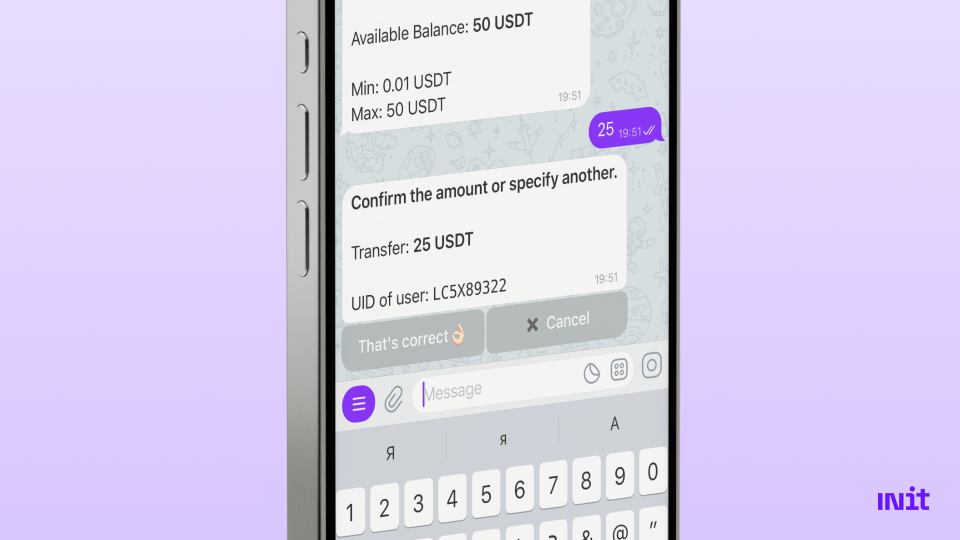
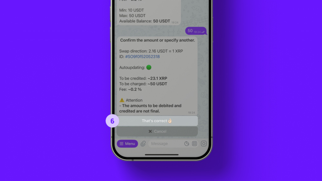
Here’s an example of what the confirmation screen for a transaction looks like in INit.
6. The Role of Visual Hierarchy
Not all information on a confirmation screen has equal importance.
Key elements should be visually prioritized:
- amount
- destination
- final received value
- fees
Secondary details can remain accessible but less prominent. If everything looks equally important, users cannot distinguish what matters. If the button is the most prominent element, users will click it.
Design determines behavior.
7. Timing Matters
Even the best preview fails if it appears at the wrong moment.
Effective confirmation screens appear:
- after input is complete,
- before execution begins,
- with enough time to review.
Some systems even introduce slight pauses or animations to encourage attention.
This is not friction for the sake of friction.
It is intentional pacing. In financial decisions, a moment of pause can prevent costly mistakes.
8. Reducing Errors Through Structure
Well-designed confirmation flows significantly reduce user errors.
They do this by:
- grouping related information
- using consistent formats
- clearly labeling values
- avoiding ambiguity
- showing final outcomes instead of partial data
For example, instead of showing:
- amount
- fee
- rate
a better approach shows: “You send X → You receive Y”
This removes the need for mental calculation.
9. Confirmation Screens in Automated Environments
As crypto products introduce automation — recurring payments, trading strategies, routing logic — confirmation becomes even more important.
Users must understand:
- what is being automated
- under what conditions
- with what limits
Without clear previews, automation amplifies mistakes. A single misunderstanding can repeat indefinitely.
10. Where INit Fits Into This Approach
This philosophy is reflected in how INit structures its transaction flows.
Instead of treating confirmation as a final click, INit focuses on clear, structured previews before execution.
Key elements include:
- visible transaction summaries before confirmation,
- clear presentation of amounts, fees, and outcomes,
- structured flows that guide users step by step,
- communication that prioritizes understanding over speed.
Operating within a Telegram environment makes this even more important, as interactions feel fast and conversational. By emphasizing previews over buttons, INit helps users move forward with greater confidence and fewer mistakes.

11. The Future of Confirmation Design
As crypto continues to evolve into a system used for real-world payments, business operations, and financial workflows, confirmation design will become even more critical.
The next generation of products will:
- prioritize understanding over speed
- design confirmation as a core experience
- reduce reliance on user assumptions
- integrate previews deeply into flows
- treat clarity as a feature, not an afterthought
In a system where actions are final, the quality of the confirmation layer defines the quality of the product.
Final Thought
Buttons trigger actions.
Previews shape decisions.
In crypto, where every action carries weight, that difference matters.
The best products will not be those with the fastest flows — but those that help users understand exactly what they are about to do. Because in the end, confidence does not come from clicking faster. It comes from knowing.